LAUNCH! - "Screw Loose"
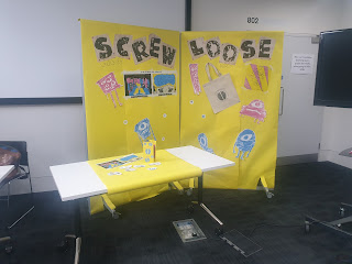 |
| 'SCREW LOOSE' complete expo |
For this project, as a group we created a brand (titled: 'Screw Loose') and hosted an expo to display the brand's intentions (to highlight and argue against the stigmas and misconceptions surrounding mental health/behavioural conditions such as OCD, ADHD, and Anxiety)In producing and displaying the final expo, the overall outcome was relatively successful. However, this process was not without its challenges and difficulties.
 |
close up of
separate assets |
Throughout the entire task we found it difficult to stay on track with one another’s work pace – frequently we had to reconvene to consider how far we were in the project, reminding ourselves/each other of the desired outcomes and the brand identity so as we all maintained cohesion across our own additions to the expo.
Within this process, I and another member of our group discovered we were very much carrying the process without too much assistance from the other members. To address this situation, we lessened the workload on those other members to ensure that what they did create was more achievable and would still be of high quality for the final expo. We then ensured that we both understood our own roles and planned out our timings for creative our individual assets accordingly. In doing so, I feel I was overly critical of other members of the group for not supporting us in this creative process. In the future I plan on approaching similar situations with a more methodical demeanour to achieve the best results from every member of the group.
 |
close up of second
panel of expo |
The final display achieved exactly what we set out to achieve – with a use of bold but inviting colour palette, punk-inspired style direction, and direct tone of voice. I believe that, regardless of earlier concerns about cohesion between our own works, all the assets created clearly incorporated the key elements of the brand identity – colour palette, decisive typefaces, and a general informative direction towards the audience. We achieved this by sourcing yellow poster roll to provide the backdrop of our display, using a mix of pins (fitting within our colour palette) and masking tape to secure assets to the display, and using unbalanced angles to display our work. All these elements reinforced both the message and style direction of our brand.  |
close up of first
panel of expo |
When it comes to my own contribution to this project, I feel the comic I produced works well as a piece of informative and promotional material to both reinforce our brand and send a clear message. I made sure to utilise and maintain every aspect of our brand identity, such as the wording of the comic, the typefaces used within the comic and for the titles and captions, full use of the decided colour palette, and a line art style with varied line weight that felt erratic and loose. The characters I developed for the comic were also used as integral assets in the final expo display, as well as our mock-up website and additional materials (stickers) for audiences to take away. This reinforced both the brand itself as well as my own input into the overall stylistic direction of the brand identity.
In future endeavours, I hope to plan out my initial ideas more decisively to manage my workload more coherently. This in turn should help me feel more confident in being able to deliver my outcome to the desired standard and effect.
Padlet Link: https://padlet.com/c_mitchell6/launch-screw-loose-dlbays449x137wqt


Comments
Post a Comment