The Design Process: Week 1 - Discover
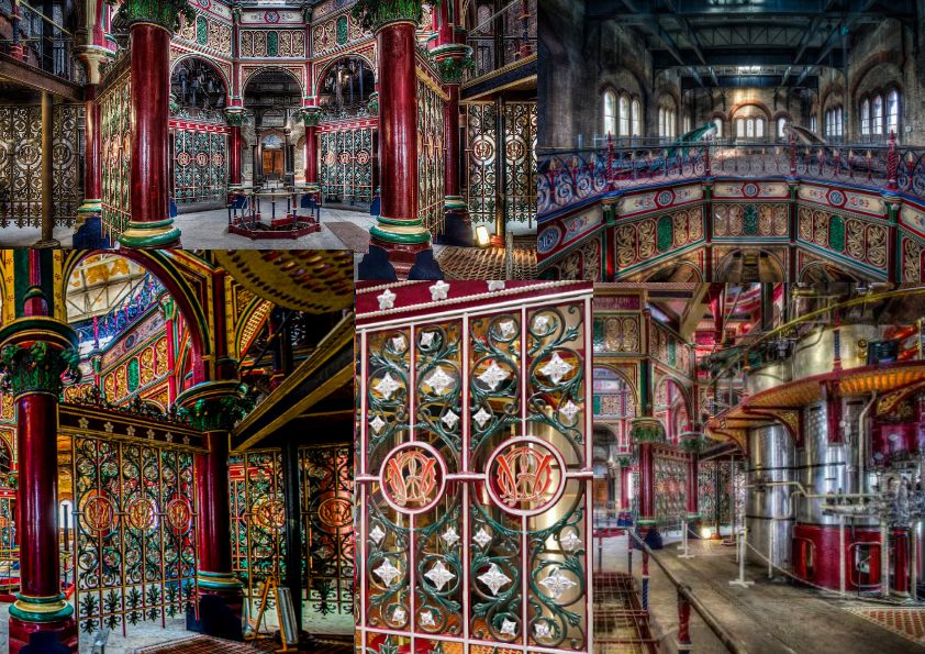 |
| Crossness moodboard |
To begin with, I needed to think of a couple of places to get an idea of which one resonates with me the most, and then further engage with these thoughts by researching the one which piqued my interest the most. To do this, I used a variety of sources to gain a better understanding of the historical background and visual aesthetics of my chosen place.
 |
| Crossness extracted colour palette 1 |
 |
| Crossness extracted colour palette 2 |
To better understand Crossness, I gathered research from multiple sources - starting with the gallery from the official Crossness website, which led me to further research the historic prevalence of the site through their official online timeline. Both of these sources helped me to gauge the intricate shapes and colours of the pipe works, railings, and insignias found throughout the location, and their significance in the creation of the pumping station.
Continuing my research to a broader view of the Victorian period, I found imagery from the publication "Victorian Public Houses" (Brian Spiller), to further my understanding of the typical shapes, forms and textures frequently found in other Victorian builds.
 |
| Brief sketches and research of insignias found throughout Crossness |
 |
| "The Prestige" set design and aesthetics moodboard |
 |
| Brief sketches of character design elements, colour palettes, and environments |
The idea that frequently came to mind throughout these ideation exercises was creating a series character designs to embody the visual aesthetic of the location. This idea has its roots in my own personal interests in using drawings to portray a narrative and/or express feeling through comics and cartooning. The idea became ever more secured when I created these mini visual experiments, encouraging me to visualise how I could incorporate key aspects of the Crossness architecture and interior design into visual design elements for fictional characters.
 |
| "The Prestige" costume design moodboard |
 |
| A page from "Victorian Public Houses" (Brian Spiller) |
ject. I am often quick to disregard evidence of my development process throughout all of the work I create - only keeping the final product. This week has given me an understanding of how this entire process is relevant, and can actually be a very reflective experience when looking back through previous and ideas and considering how they have gone on to influence later iterations to lead into the final outcome(s).

Comments
Post a Comment